Best Practices for Boosting Product Page Success
You’re at a casual get-together where your friend offers you the most remarkable Pinot Noir you’ve ever tasted. Looking at the bottle, you learn it’s from a vineyard you don’t recognize.
Your host tells you she picked it up when she visited the tasting room on vacation last month. “Don’t worry,” she tells you. “You can order directly from their website.
Back home, you log on to the winery’s website to find artistic photos of the vineyard, an article on the characteristics of the terroir, and details about the vineyard’s long and impressive history.
But what’s your experience like when you visit the product page and are ready to place an order? Is the page hard to navigate? Can you find the wine you’re looking for easily? Does the page feel outdated?
In the age of Amazon single-click ordering, consumers are accustomed to a super simple online shopping experience. And while more wineries are selling online, many of their websites have unattractive, clunky product pages that turn off potential customers.
Below, we break down how to create an exceptional experience on your product pages to improve the customer experience and sell more wine.
Best Practices for Your Product Pages
After providing a superior product, nothing is more critical for an optimal customer experience than your product pages. After all, this is where online browsers turn into paying customers.
Like the rest of your website, your product page should convey a consistent brand identity, with a professional tone and recognizable style. This is your first step to establish trust and build an ongoing relationship with your online customers.
Just as important, your product page should be easy to navigate so customers can buy easily. That’s because your product page is much more than a list of what you sell. When this page is well-designed, it helps remove barriers to purchasing, giving consumers everything they need to make a decision—and hopefully, order some wine.
Your Product Page Checklist
Unlike a tasting room where customers can try before they buy, your product page is completely self-serve. So it should be seamless.
Here’s what your product page should include:
1) AN ATTRACTIVE FEATURE IMAGE OF YOUR PRODUCT
This is your customer’s first impression and your chance to excite website visitors. Use polished, perfectly centered product images with a white or light background and soft or no shadows. (Read here for more photography tips.)
Chardonnay by Barboursville Vineyard
2) A UNIQUE PRODUCT DESCRIPTION WITH A TITLE, PRICE, AND NOTABLE FEATURES
Here’s an example:
2017 XX Red Blend $35.00
This blend is a perfect ten. A combination of 70 percent Cabernet Sauvignon and 30 percent Merlot from the XX vineyard in the XX AVA, this wine is a wonderful portrayal of where it comes from and how it was made. Grapes were picked at optimal ripeness for fruit flavor and texture, and the juice was fermented in stainless steel before 14 months aging in 40 percent new french oak. The result is soft tannins and a lush, velvety texture.
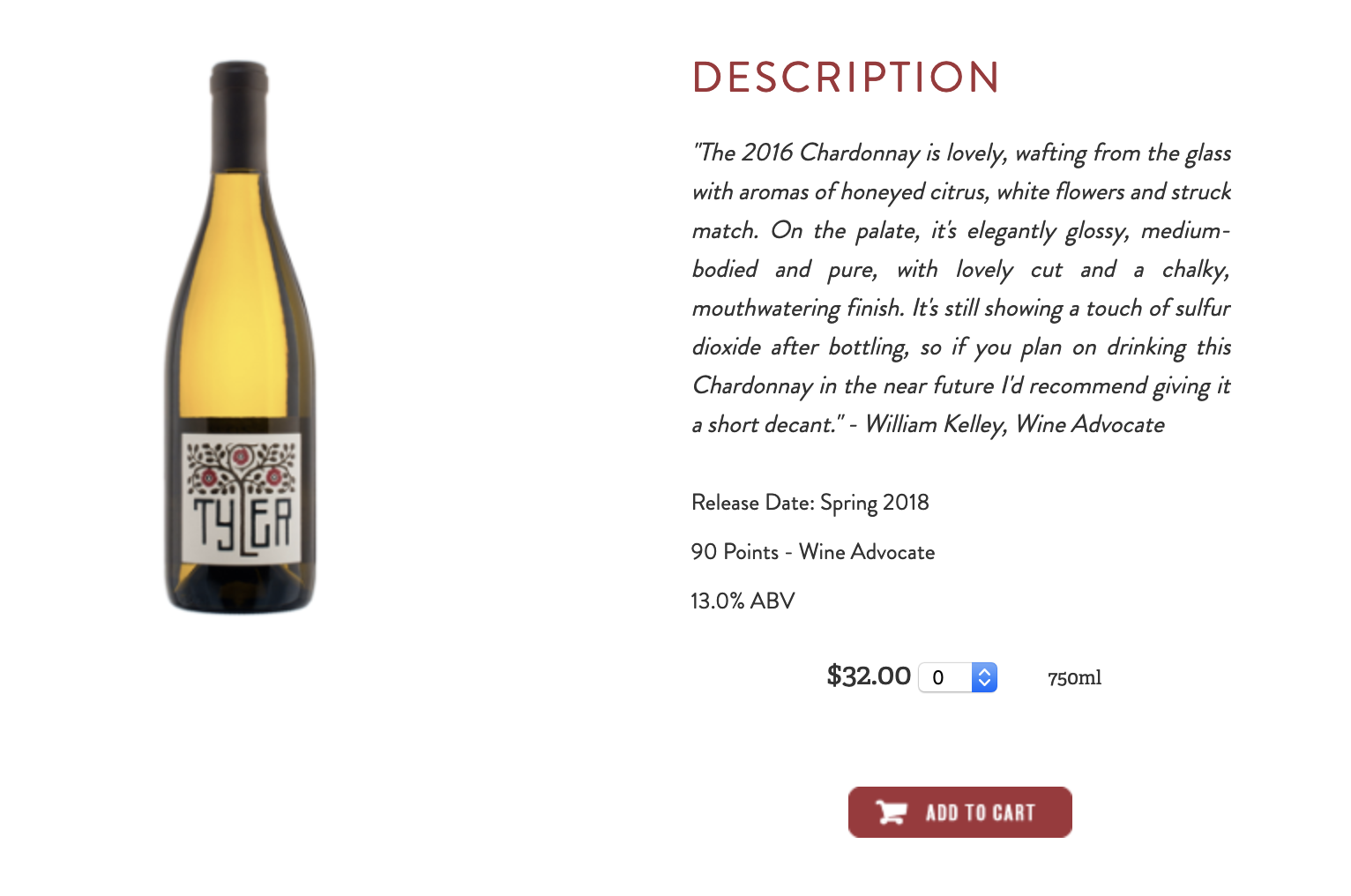
3) A CLEAR CALL TO ACTION
Make sure the button to Buy or Add to Cart is easy to find and near the product description.
Tyler 2016 Chardonnay
4) SOCIAL PROOF
Show how much others love your wine by including reviews, ratings or awards. Peers and reviews are a huge influence on buying decisions. Including these pieces of social proof will help shoppers feel confident in their decision to buy.
5) AUTOMATED PRODUCT SUGGESTIONS
To encourage shoppers to purchase additional wine, showcase other products with one of the following options:
Customers also viewed: Show similar vintages
Related products: Cross-sell wine glasses or holiday gift packages
You may also like: Upsell to more expensive vintages
These types of automated messages can also include prompts to join your club or educate the customer about your allocations program.
For more information on automation, read Boost eCommerce Sales with Personalization and Automation.
6) HELP FROM PERSONAL SHOPPING ASSISTANT
Adding a pop-up from a live chat system to offer help to customers with purchase decisions can help you close sales, especially with shoppers new to your wine.
In short, the key to designing a product page that drives your online wine sales is looking at your online shopping experience through the eyes of your customers. When your product pages and shopping cart makes buying easy, your customers will buy more. (And perhaps, even leave a review of your wine to encourage others to buy online, too.)
So, how do your product pages stack up?
For a free audit on your website’s customer experience, talk to an eCommerce expert with VineSpring. Contact us today.
Do you want more information on how to create a compelling online experience? Download our UX guide and get started!


